
The Client
Tinder (previously Tinder Lab ) is a software development company based in Singapore, it is a subsidiary company for any cool side projects.
The challenge
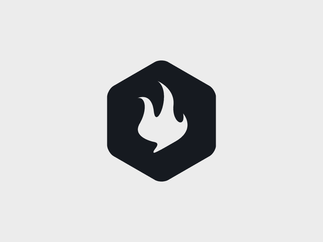
The idea of the name, Tinder, to spark off something. It's a fire stater. Therefore, the elements / concept will be something relevant. There are a lot of fire / flame logo out there, it is challenging to make a unique one.
The Solution
After the brainstorming session, I understand the needs from the client and the target audience. More importantly, the language they would like to use to communicate with the audience.


We experimented by using both geometric and organic shapes along with lab elements. ( I’d lost my initial sketches as this is a pretty old project, but one of my favourite) The result is clear, the organic shapes contained within a geometric device communicates clearly and accurately. It is easily recognisable.
The Result
After a few round of discussion with the client, we actually make the decision to go with this due to its boldness and simplicity.
